Rethinking the homepage [Part 1]: The Big Story Day
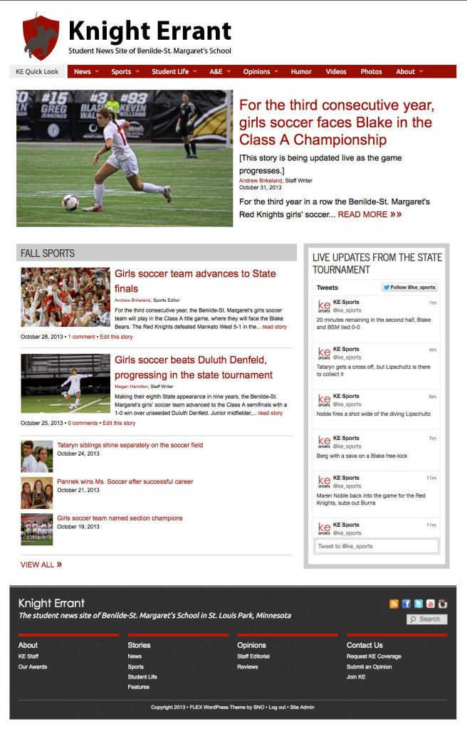
My students don’t get to cover big stories very often, so when one of our sports teams makes it to the state title game, we definitely consider it a big story day. This year, when the girls soccer team of our school was playing for the state championship on Oct 31, my online editor-in-chief decided to make over the homepage for the day in order to showcase the staff’s work on that big story. She removed all the usual category preview widgets, the video widget, and the social media widgets from the normally busy homepage and simplified the site to three main elements:
- a single top story about the championship game in progress that was updated continually throughout the game
- a category widget that displayed links and teasers to the other stories that had been written in recent weeks about the girls soccer team and their run to the state tournament
- a live play by play twitter feed of the action at the tournament.
Too often, high school news organizations view their website homepages as static –– they set up a look for the year and then just allow content to work its way through through this page as the year progresses. This thinking is a missed opportunity to use the homepage as a place where the journalism class can create in-depth coverage and use their layout to show readers what is important on any given day. Anyone who happened to visit the Knight Errant on Oct 31 would have no doubt what the most important story in the school community was.
With a print edition, where a story is placed on the page signals to the reader that story’s prominence. With the way most WordPress websites are set up, though, there isn’t this natural positioning to let the readers know what’s important. There’s often a showcase carousel at the top of the page for the “big” stories, but that big story gets lost in the rest of the carousel stories, and the rest of the homepage can be a jumble of teasers and thumbnails without there being a clear signal as to what readers should pay attention to next.
But this type of attention should be paid to a site on more than just the big story days. Too often on high school news sites, brief and trivial pieces are often given the same treatment as longer, more important stories –– they’re simply ordered by date with the most recent story (rather than the most relevant story) on the top. News staffs should be differentiating the strong and important stories from some of the shorter, more trivial pieces; one way to do this is to use a separate category for the shorter pieces to keep them separate from the longer, more in-depth stories. News staffs should also continually evaluate the placement of categories on their homepage and tailor their design to match the news of the day –– one easy way to do this is to set the category with the strongest content in the most visible and prominent position.

Leave A Comment